There’s this great graphic showing the ancient seashore in North America and how this 100 million year old geological feature votes Democrat. The idea is that the shoreline was a rich habitat for creatures that died and formed the rich black soil in the deep South that was perfect for growing cotton. Because of slavery the current population demographics skew Black, and by extension, Democrat.
It sounds on the face of it like an example of false correlation but that article does a pretty convincing job of connecting the otherwise completely unrelated dots. There are countless examples like this, where history creates ripples, enduring patterns separated in time but intricately tethered in meaning.
Stock price action works in much the same way: a perturbation in price will cause oscillations and trends up or down, and when price action revisits this area traders will take that historical data into account and manage their risk around it, creating new perturbations that reinforce the old ones.
These perturbations can be a lot of things: an old all-time high, a particularly bad FOMC day, even a nice round number like $100. When traders see candles that formed in these areas of relative equilibrium but quickly ramped away, they see an area that will need to be overcome; different people will have different opinions of which way price may go at these tipping points, but until price actually tips all anyone can agree on is that it’s an important area.
This is fractal behavior, meaning you can see it on all time frames. Larger ones like the daily chart leave huge interactive pricing areas that smaller charts can’t help respecting in some way. Other significant price points like recent highs and lows will affect lower charts similarly.
This is why traders will often look for these landmarks in making pricing decisions, ironically reinforcing the significance of those landmarks. While it is impossible to predict which ones will pivot the price (trend momentum determines that), price almost always pivots at these particular spots, and the areas can migrate over time when price almost, but not quite, overcomes an area.
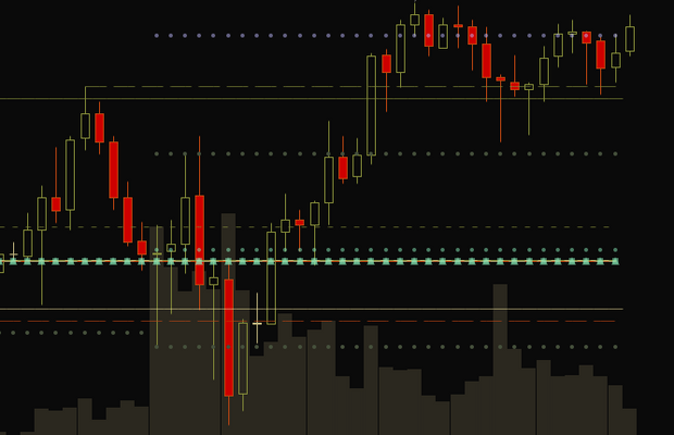
My Highs and Lows study tracks a large number of these levels. The big ones are the previous day’s high, low and close, after hours and premarket highs and lows, and the first half-hour’s high and low. The first half hour is significant because that’s often the highest volatility of the day, and price will either stay within that range or break out and stay out of it.
There are other deductive levels included, such as the 161% above and below the opening range, as well as its midpoint. Though traders don’t necessarily trade off of these lines, the price action often interacts with them nonetheless due to the way buyers and sellers interact with pricing oscillations.
One I like is the Average Daily Range, which is just the average distance from high to low. I like to plot that from the current day’s high and low to see where that value might be if today is anywhere near the average.
Probably 80% of the trading decisions I make take these levels into account, usually providing confluence. I don’t get into a trade unless I have several reasons in favor, such as price nearing one of these Highs and Lows levels, or a round number psych level, or a Jimmy Zone, or a trend line, and so on. The more confluence an area has, the more likely it is to be the place that price will pivot.
If there’s one thing you can count on it’s that history will repeat itself, and any time you have higher probabilities of something happening you have an edge.

