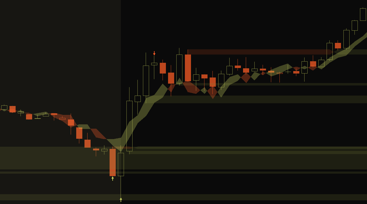
Einstein famously joked that quantum entanglement was “spooky action at a distance” because it defied common sense that anything could interact instantaneously at arbitrary distances seemingly without a connection between them, but in experiment after experiment scientists have shown that if you divide your bag of quantum cats and fling them at remote suns they will continue to hiss in unison until they’re nothing but identical burnt hair smells.
When I first started trading, most price movements were a mystery. I’d have no idea that FOMC was why the price was banging all over the place, or that recent bad news could cause a sudden and immediate drop in value. For the longest time nobody had told me that if a company is large enough, its price movements will more or less mimic the top market indicators. Or that most market segments have leaders that other tickers will follow in sympathy.
I’ve been trading AAPL exclusively for the better part of a year now, and I always have ES up so I can see what its relative bias is. When AAPL pushes above where ES is trading candle-per-candle you know there’s excess buying pressure unique to AAPL that you can take advantage of for a short-term long, or arbitrage of the lag. If you were fast enough you could even arbitrage between ES and SPY.
Ha ha, you’ll never be fast enough. This is exactly why High-Frequency Trading exists. They’re probably already using quantum computers entangled directly with the incorruptible corpse of St. Steve himself.
Without external pressure, these imbalances will attempt to reach equilibrium with ES so when it trades lower you can usually count on AAPL following suit if it hasn’t already. This is great for scalping or finding the best entries.
That’s why I created my new study, Sympatico. There’s a built-in study in ToS to overlay a ticker (‘Comparison’) but it’s not relative so if you overlay ES on AAPL the overlay is way up in the thousands which is not super helpful. I knew there had to be a way to adjust for the difference and hopefully create a meaningful visualization in the process, but this one was really tricky to get right.
At first I tried just a straight shift: take all the candles and make their midpoints more or less AAPL height. The range is so different though, that I also had to adjust the candle heights to something more or less AAPL sized. But then price action diverged pretty quickly, because let’s face it, as much as some of us pretend, AAPL is not the entire market.
Then I tried to have an ATR-adjusted percentage, but each day it would change slightly and the candles didn’t overlap in any kind of meaningful way. I even tried relative difference from the previous variable and plotting from the midcandle of the next but then they were all tied at the midcandle and I couldn’t see relative price action.
I messed with a lot of various ideas to relate the size and price action. What I wanted was a real-time relative movement normalized per-candle so I could see at a glance in one chart whether AAPL’s current movement was tracking at parity or was advancing or lagging.
Finally it hit me: what I needed was a percentage that would relate the underlying candle with the sympathy’s relative change over time. But how do you normalize things that diverge so much? The key was using the volume-weighted average price:
ExpAverage((close * volume) / volume)
This gives you a baseline EMA over the last few candles (ExpAverage defaults to 12) that incorporates volume for a more accurate average. Tons of people use VWAP as a trading indicator, I even have a study that will plot it out from other chart periods.
Once you have a baseline you can do all sorts of cool relative transformations. What worked was taking the percent difference between VWAP and each of the candle variables (high, open, close, and low) and plotting that percentage change onto the current chart’s VWAP. The horizontal lines match the sympathy’s color and candle body size. The dots represent the high and low wicks.
I was pretty astounded at how well that actually worked. The big test was ES and SPY: they should be identical, and they were.
For a sympathy with high correlation like AAPL and ES, AMZN and NQ, or MARA and RIOT, the candles overlap such that not only do they more or less mimic their respective sympathy charts but visually quantify the lag between the underlying and the sympathy. You can even add multiple instances and see both NQ and ES on AAPL at the same time.
I could always tell from the price action how AAPL differed from the rest of the market. Now I have an objective indicator that can tell me historically at a glance exactly when and by how much on any time frame in real time.
This isn’t game changing but it does mean I can run with fewer charts since I don’t necessarily need multiple time frames of ES, just AAPL with Sympatico. It will never obviate the need for charting ES but it sure makes it easier to see the relative movements and exactly which quantum cat is responsible.

