Way back in the early Renaissance, the use of perspective was a closely-guarded trade secret among painters. The first time it showed up was in the 1400s, and before that artists would just sort of eyeball things. It was the Uncanny Valley of orthogonals.
When I first started trading the craze was Supply and Demand zones. There were tons of videos explaining how to spot areas of consolidation and then use those to draw rough zones where future price would often interact.
The problem is, all of those people have their own system for drawing these zones, some of which were contradictory. Many of which inexplicably didn’t work. Nobody could explain why these zones were there, most just sort of hand-waved at mysterious ‘market makers’ and how they want to buy at a particular price and nowhere else for their own inscrutable purposes. It was more of an art than a science. They were just eyeballing things.
Then I met @JamesLeFaith who showed me what was really going on. Once he explained it, I haven’t been able to see price action in any other way. It revolutionized my trading. There’s a whole lot more to what he does with this information, so go follow him on Twitter to learn more.
Every significant price movement leaves behind it a risk barrier at the start. Find the biggest candle on a chart and look at its shape: there’s the open price, a wick back, then the candle rockets away toward profits.
Suppose for a moment that you’d gotten into that trade. Where’s your risk level? For a lot of people, they’re looking at that candle’s open as the warning area and the wick as the sell area. If those break, might as well get out. If they hold, get in for more.
For others not already in the trade, that candle’s open is a potential entry, because look at all that price action all the way down, maybe they’ll get lucky and that will happen again. Even if you’re in the trade, you may want more because your original thesis may be sound and you want to buy the dip.
Still others will see this as potential weakness, and buy in using that candle’s open as their risk, so if this tipping point tips over they’re ready to buy more and get in on the quick swing away.
Either way, all that adds up to price congestion right at that significant candle’s open. It’s not market makers, just a crowd of people all seeing the same thing in different ways with different reasons for buying and selling decisions.
This is true for every single chart period, all time scales. The higher the period, the stronger the zone, but they also get larger and less useful to smaller period price action. But the fact that this idea exhibits fractal behavior cements its inherent utility as a trading indicator.
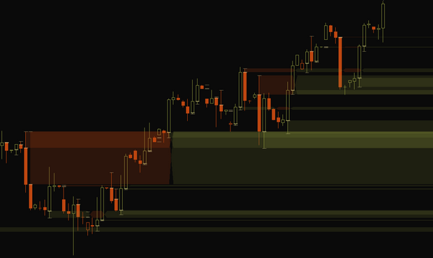
I wrote a study called Jimmy Momo Zones based on @JamesLeFaith‘s ideas that encapsulates this risk, finding the biggest candles on a chart and drawing a zone from their open to the wick, defining an area that is likely to either bounce price away, or if price action pressure is strong enough to work through the zone will propel the price even further along, possibly after retesting the edges a few times through consolidation.
Often new significant candles would form, with their own zones trailing behind, overlapping the older zones and reinforcing that price action. I’d draw rectangles over these zones on stronger time frames, such as the 4h and daily, and then trade the lower charts when price action neared those regions.
I hope that adds some perspective to your trading!

