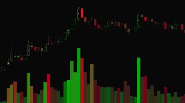
Anybody who tells you they have a ToS study that shows buy and sell volume is oversimplifying things: there isn’t one. For every trade there is exactly one buyer and one seller, the volume is always 50% buy, 50% sell. The only question is, did I buy from you, or did I wait for you to sell to me? And did you run out of stuff to sell me at that price so I had to go buy more from the guy offering it at a higher price?
While you might be able to watch Time and Sales for real-time volume on the ask vs bid, ToS doesn’t let you capture that information in a study. We only get five numbers: high, low, open, close, and volume. Six, if you include time. That’s it, that’s all we have to work with.
So what the heck do all those ‘Buy and Sell Volume’ studies really do, if the only variables you have access to are high, low, open, close, and volume?
The answer is a bit of logical deduction. Because buying on the ask as opposed to waiting in a bid will move price upward, if there are more buyers than sellers price will go up and the candle will close above the open. Knowing this plus the volume of the candle you can deduce that on a whole there was more buying volume than selling volume.
The actual formula for this deduction is:
(close – low) / ( high – low)
In other words, the amount of the candle from the close to the low as a percentage of the total candle’s price movement. If a candle is green, that’s mostly buying pressure, and the remainder must be selling pressure.
This doesn’t take into account a huge amount of buying pressure that breaks through a level, rockets up, then falls back down and further under far less volume. There’s no way to tell exactly how the volume is distributed within a candle, so that candle that had a giant amount of buying pressure instead looks like it has a giant amount of selling pressure instead.
But what does this really tell you that the shape of the candle can’t? Over time, you can build a picture using volume. It’s just another way of visualizing candle data to help you build a mental image of the price action. But at the end of the day, you could also just look at the shape and color of the candle to see how much of it was buying or selling volume.
Since this buy/sell volume is a fiction based on our five variables, there are other fictions we can create to help us visualize candle data too.
I wrote a study called VPA Candles that colors the candles on a spectrum from red to green based on that buy/sell volume formula. The higher the buy percent the greener the candle, and the higher the sell volume the redder. A perfectly stable candle is kind of a brownish color, halfway between green and red. This lets you see at a glance from the color spectrum a relative amount of buy/sell volume based on the candle shape, like training wheels for people who can’t read candle shapes.
Additionally, the candles are brighter when the volume is higher and darker when the volume is lower, so a high-volume buying candle would be a brighter green than a lower-volume buying candle. Visually, this makes the important candles pop out more, and adds additional cues to the volume graph.
Often this leads to a lot of dark brown candles in between spurts of bright green and red candles, as that’s often how price action works. Not super helpful for seasoned traders, but if you’re just starting out it reinforces why certain candles mean different things based on those five variables.
If you want to try it out, you can find VPA Candles as well as all of my other studies at https://bit.ly/tos_scripts.

